Thursday, 17 March 2016

Weekly Relfection

 Thursday 17th March 2016 

Captains blog supplemental: for two days I have been doing concept art for my post apocalyptic sports car. With the rest of my time worry about my Work-based learning module.

I chose to make an apocalyptic vehicle because I have never created a realistic 3D model of a car.
Instead of creating a cartoon object I wanted to step out of my comfort zone. For my Digital skills module I could do anything I wanted. These are 4 options I wanted to do.

  • Create a Realistic 3D model of an Apoc car asset for a game.
  • Sculpt a realistic creature using Z-brush
  • Animate and or rig either a character or Vehicle.
Here's a sneak peak of what I created so far

I want the paint job to stay the same however certain elements may change during future development. It's amazing what a few layer styles can do to an image.

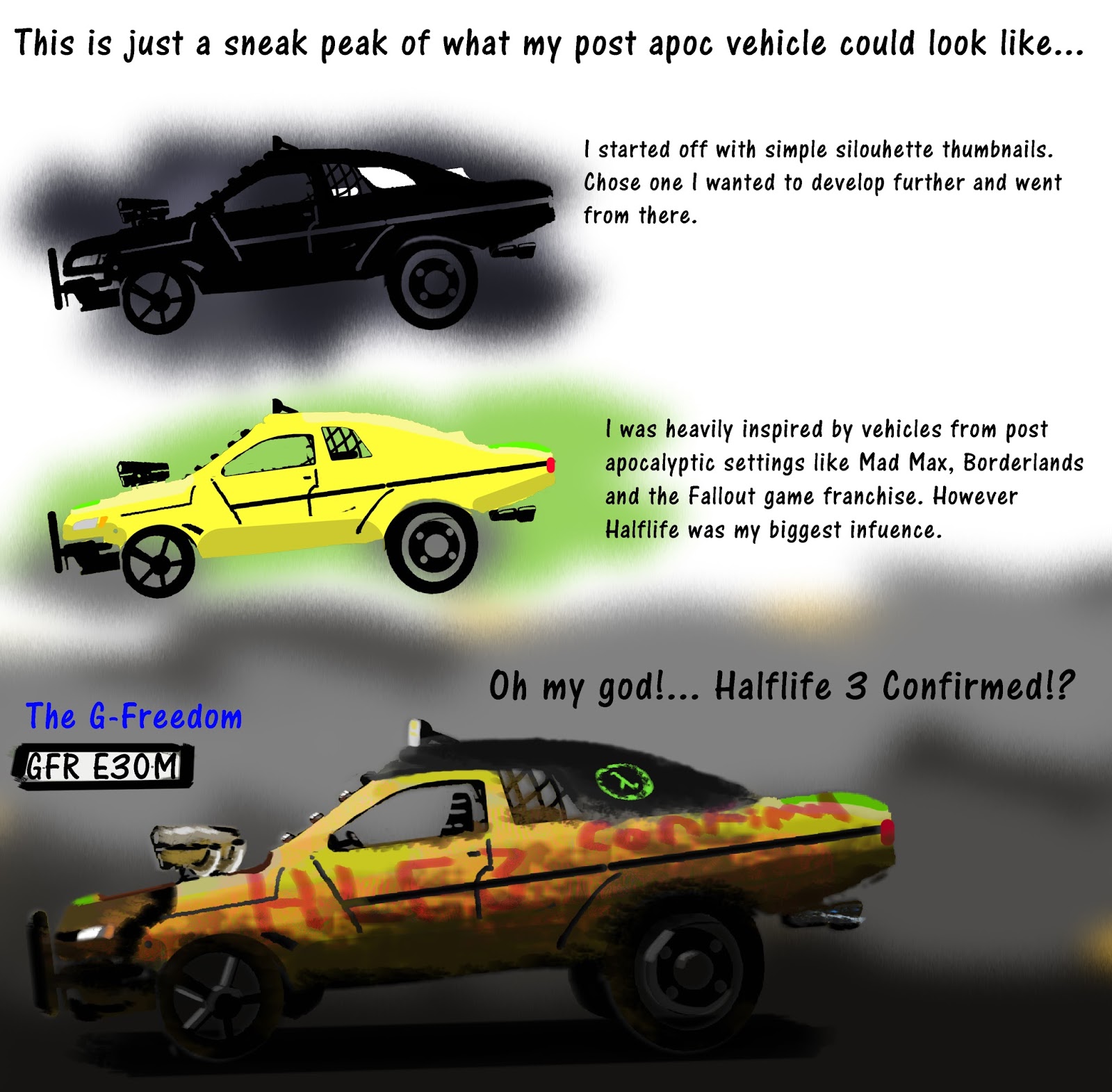
Here is an alternative design I am Working on.


This is an experiment about mixing two chargers to make one super bad ass looking ride!


 Reviewed Targets
  •  Consult with the tutor to make sense of Workbased learning module.
  • Create a relevant background for FD Games Blog.
  • Get to bed at 10 Oclock
  • Spend a few hours playing different video games.

Weekly 4 Targets
  • To create front and back concept art for apoc car.
  • To find out what has to been done for workbased learning module again!
  • Get feedback from peers and tutors.
  • compose a vehicle mood board.

Monday, 14 March 2016

The New Improved totally not long winded Weekly Reflection!

Monday 14th March 2016  (Most Recent Update)
Captains blog supplemental:

Today I spent most of my day sorting through a box of my old artwork.
I found out I had improved looking back however am having difficulty containing my artwork.
I have used countless poly pockets. However I have not finished sorting.
I will admit somethings I drew were laughable and embarrassing however I am glad I have them because it shows I have grown into a professional artist.


During my week off of college I spent most of my time playing video games with my parents. Mostly Survival sandbox games like Rising World and Minecraft and others Like Gary's Mod and Rouge Legacy.

I had some off days where I felt like doing nothing which made me feel awful because I felt like I couldn't do anything. however on the good side, over my week off I produced a set of development sheets for my own self branded logo!

I recently noticed my Weekly / Daily reflection was getting long winded. The reason for this is because when ever I use this blog it's Collage oriented, meaning I use this to quickly jot down what I did for the past, coming of last week. Anther thing I found out was these Daily reflections are getting in the way of my life so I will probably create this as a weekly reflection. I may add imagery when I have the time in the near future.


 My 4 personal Targets (most recent set of targets)
  •  Consult with the tutor to make sense of Workbased learning module.
  • Create a relevant background for FD Games Blog.
  • Get to bed at 10 Oclock
  • Spend a few hours playing different video games.

From now on below each weekly reflection I will have a total of 4 targets to achieve. I chose to do this because I 4 is an even number and I can't stand odd ones, but more importantly it is a realistic approach as to having 10 targets to juggle at the same time!

Oh and as for the title that's going to be my new blog phrase. I may change it to Commanders blog incoming or something fun like that.

Tuesday, 8 March 2016

Inspiratinal logo Designs!

Hey guys check these out I googled  'amazing logos' and these are 5 that really stood out!

first we have Bigcolors

what's not to love it's a whale! awesome design!

The fonts not too busy
I like the way they created this Big = the size of a whale and color adding
a rainbow.


heres the link to the actual site: http://bigcolors.com/

 swinging in next we have Spartan Golf Club

this was cool when I saw it not only does the whole logo show a silhouette of a spartan but his face a golfer. where as the head piece is the swing of the club!

again simple to read font and straight to the point.


here their site: http://golfspartan.weebly.com/

This one really blew me away!

 I love the colors in the design and the cool design of a face made out of the color. brings a new meaning to the colors of the wind!

Good consistency keeping the font clear but also in the same color scheme.


Checkout Creative- IDs site here: http://www.creative-ids.com/
also when you get the chance swing by his Deviant art page lots of cool stuff! http://creative-ids.deviantart.com/

This is a Russian logo called  Sletat

 I really like the colors in this however I also like how they make it seem like the airplane has wings like a bird which is neat on it's own.

I found this logo on was downgraf.com.
http://www.downgraf.com/inspiration/20-examples-of-inspirational-logo-design/

Without text I don't really understand what this is something to do with a plane? however it is still a beautiful design!


heres thier website: http://sletat.ru/

Now check out  Liquid Fire! 

The concept is super hot it's a really cool logo. OK puns aside this is a really great logo. The colors are not to bright or vivid it stands out on almost any background. and it's  readable when scaled down.

I like the chosen color pallet and the nice curvy shapes.

This logo has actually inspired me to do my own logo design.


I found this one of Arpad's Deviant art page check out some of his other logo designs.   http://arpad.deviantart.com/