Friday, 6 May 2016

5 Great Examples for Creative Business Card Designs

This is just a list of 5 awesome design ideas for a creative business card!


This is something I would be willing to do a business card in the shape of a paint pallet, Brilliant!

Nice big creative font for the name
cool icons showing contact information
and a good minimal colour scheme.

This has inspired me to come up with something similar to this only it would have more colour.

I like the simple graphics for the icons I will definitely try this out when I create my own business card.

The concept was actually created by Tanya Kozlova

here a link to her Behance page https://www.behance.net/kozlova

http://www.creativebloq.com/branding/business-card-designs-5132829

For people who love lego your gonna like this. Check it out these employees get their own mini figures as business cards!

What could be cooler than a lego min fig that looks like you and even has the name and contact details printed on the figure. Neat idea

Text could be more creative perhaps a friendlier font? this lego is it not it should have a fun lego font!

This has inspired me to create a lego business card of my own!


http://www.dailymail.co.uk/femail/article-2653243/Everything-awesome-Lego-executives-use-customized-mini-figurines-business-cards.html


This is one of the coolest musical business cards ever! not only does it look pleasing. It  can play a sweet classic rock tune too!

Being a huge fan a musical insterments and music in general I would love to have one of these.

This has gave me an idea of making a piano business card!


This is an interesting idea what do you do when your stranded on a island or dark Forrest have no food don't worry just make sure you don't forget to back your handy business card!

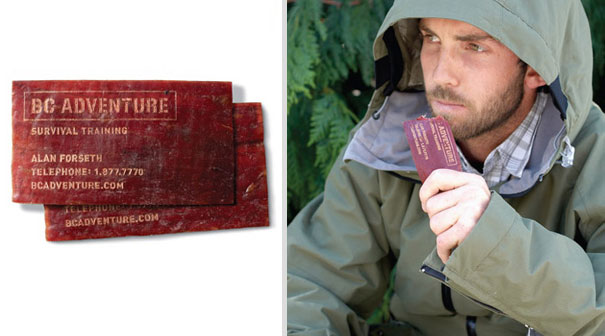
Seriously  a business card made out of meat?!
Wow this is a really cool idea not to say I would do this myself but you got to admit you want one!

This has given me an idea to make an edible business card dang it now I'm hungry!


Say Cheese! Wait it's a business card?

At first glance I though this was real. for photography this would be epic!

nice consistent text and cool interface design.

Weekly Reflection!

Captains blog supplemental :

Over the past few days things have been hectic. however before we get into that the idea for my apocalyptic vehicle has drastically changed.

After getting feedback from both my Tutors, Parents and peers I have changed from making a hyper realistic apocalyptic vehicle to a simple cartoon stylized set of vehicles. This could be because of bad timing on my part or because my style has been influenced from playing simplistic blocky, voxel games. Games like Smashy Roads, Traffic Rush 2, Smashy City and of course Crashy Dashy!


Thursday, 14 April 2016

Yet another exciting weekly refelection!

Creative's log supplemental:

As I've said before in my last reflection I have decided to do a crazy cool idea. This was creating a 3D model of a apocalyptic vehicle. I have done the concepts and have started some attempts at modeling the beast. Not to be confused with 'The Beast' within the set of apocalyptic vehicles.

Anyway been battling creative block and am fairly confident with the concept I chose.

These are some dead early images of how I am tackling starting the 3D modeling phase.
See I told you I would add some images.


With the help of my tutor he made this mock up of a dodge ram from a blueprint. At this point I was not in anyway near certain how I was going to start so it was good to get a little push in the right direction.


Some  different views

This is my first attempt Yay!... or not so much. Not only had I not been using a blueprint to get the right proportions down but I forgot how to use the mirror option to get a spitting double. How embarrassing. To me this looks like either a doorstop or a truck cloth. yeah let's go with that the new improved car door stop tuck cloth thing!

I was mainly modeling from this view most of the time I was using Wire frame mode to push and pull verts.

I am liking this one eyeballing from my Snow Basher Ref sheet I created the some what decent looking shape. Looks like a truck to me! I added some cylinders on the sides cut them up and used a shell modifier to block out the wheel arches. probably not the smartest way to build a truck but eh I looks Ok for my first time.


I wanted to add some wheels to see what it would look like This is just a mock up of the model the first stages of it. Oh and the reason there are two colors is because of the mirror modifier.


 Yep bet you didn't see this one coming. I started again totally from scratch not reference. The reason I did this was becuase at the time I have been playing many simple mobile games like Smashy City, Splashy Roads, Crossy roads. and in my mind I was saying well these modeling look really easy to make. So this could be a fall back plan If I don't get this truck finished.


I created these type of toy car hybrids in Cinema 4D before learning how to create things within 3Ds Max.


In Conclusion what I have learned over the few days back from Easter is if your going to tackle a big project like building a car. Use reference imagery to at least get the proportions right.

I am sort of proud of these models but not as nearly as proud as I would be fishing out a hyper realistic model. but one step at a time.


As for my work based learning I finally decided what I wanted to do! Unfortunately I can't show the pictures at the moment because I have to get around to scanning. however cleaning around the house has sort of taken over my schedule from time to time.

My Concept is a Angel undecided. could be good, bad or both. I looked at a lot of reference from barely clothed to robed and even decked out in sweet Armour. My goal is to get a balance so she doesn't look to inappropriate. I mean I could make her but naked but I don't think realistically going out in battle field naked is really the best ideas.

I will eventually get around to adding some images of my undecided angel. for now however I need to focus on the task at hand modeling my Snow Basher!

I hope you all enjoyed reading this silly weekly reflection and I'll have more to follow soon!

Saturday, 9 April 2016

Weekly Reflection

Artists blog supplemental:

Been watching Zootropolis trailers and I am eagerly waiting for the DVD release!
I have been so inspired by this film that I have bought both Zootroplis / Zootopia's Art of book.
As well as two how to draw Furries books. It has also inspired me to create some more anthropomorphic characters. I already have a bunch however these new ones will be more animal looking with being as intelligent as a human and of course walking upright. The ones I draw have a way more human look minus the fur of course.

I have been having some time you could say a struggle trying to work. my main battle was struggling to keep and come up with new concepts. Others were lack of motivation not being very inspired and some times depressed. However I'm saying to my self to stay positive and I'll get through it!

My current modules are Digital Skill and Work based learning. I chose to design a 3D apocalyptic vehicle after being inspired by Mad Max 1 to 4. and other apocalyptic movies like 2012, The Day The Earth stood still and Terminator Genesis. It's taken a turn where I had days where I could not decide which vehicle I wanted to model however now I have broken it down to two cars.

As for work based learning  It is suppose to be a live brief
I have went from a Tiger Elf girl to an anthropocentric female tiger and finally to a angel in between stage deciding if she's good evil or both.

To break this up in less words

  • I can't wait for the DVD of Zootroplis / Zootopia
  • I am stressing over which vehicle I should choose to begin modeling. (first time modelling a car) The Snow Basher or Ice Breaker.
  • I am hoping my angel illustration will work for a contest I want to enter.
To over come these small problems I will get feedback from everyone my Tutors, friends and Family.

Oh yeah and have had Shakira's song 'Try everything' stuck in my head for over 6 days LOL
https://www.youtube.com/watch?v=c6rP-YP4c5I
Your welcome (evil laugh)
Still a good song though!


Thursday, 17 March 2016

Weekly Relfection

 Thursday 17th March 2016 

Captains blog supplemental: for two days I have been doing concept art for my post apocalyptic sports car. With the rest of my time worry about my Work-based learning module.

I chose to make an apocalyptic vehicle because I have never created a realistic 3D model of a car.
Instead of creating a cartoon object I wanted to step out of my comfort zone. For my Digital skills module I could do anything I wanted. These are 4 options I wanted to do.

  • Create a Realistic 3D model of an Apoc car asset for a game.
  • Sculpt a realistic creature using Z-brush
  • Animate and or rig either a character or Vehicle.
Here's a sneak peak of what I created so far

I want the paint job to stay the same however certain elements may change during future development. It's amazing what a few layer styles can do to an image.

Here is an alternative design I am Working on.


This is an experiment about mixing two chargers to make one super bad ass looking ride!


 Reviewed Targets
  •  Consult with the tutor to make sense of Workbased learning module.
  • Create a relevant background for FD Games Blog.
  • Get to bed at 10 Oclock
  • Spend a few hours playing different video games.

Weekly 4 Targets
  • To create front and back concept art for apoc car.
  • To find out what has to been done for workbased learning module again!
  • Get feedback from peers and tutors.
  • compose a vehicle mood board.

Monday, 14 March 2016

The New Improved totally not long winded Weekly Reflection!

Monday 14th March 2016  (Most Recent Update)
Captains blog supplemental:

Today I spent most of my day sorting through a box of my old artwork.
I found out I had improved looking back however am having difficulty containing my artwork.
I have used countless poly pockets. However I have not finished sorting.
I will admit somethings I drew were laughable and embarrassing however I am glad I have them because it shows I have grown into a professional artist.


During my week off of college I spent most of my time playing video games with my parents. Mostly Survival sandbox games like Rising World and Minecraft and others Like Gary's Mod and Rouge Legacy.

I had some off days where I felt like doing nothing which made me feel awful because I felt like I couldn't do anything. however on the good side, over my week off I produced a set of development sheets for my own self branded logo!

I recently noticed my Weekly / Daily reflection was getting long winded. The reason for this is because when ever I use this blog it's Collage oriented, meaning I use this to quickly jot down what I did for the past, coming of last week. Anther thing I found out was these Daily reflections are getting in the way of my life so I will probably create this as a weekly reflection. I may add imagery when I have the time in the near future.


 My 4 personal Targets (most recent set of targets)
  •  Consult with the tutor to make sense of Workbased learning module.
  • Create a relevant background for FD Games Blog.
  • Get to bed at 10 Oclock
  • Spend a few hours playing different video games.

From now on below each weekly reflection I will have a total of 4 targets to achieve. I chose to do this because I 4 is an even number and I can't stand odd ones, but more importantly it is a realistic approach as to having 10 targets to juggle at the same time!

Oh and as for the title that's going to be my new blog phrase. I may change it to Commanders blog incoming or something fun like that.

Tuesday, 8 March 2016

Inspiratinal logo Designs!

Hey guys check these out I googled  'amazing logos' and these are 5 that really stood out!

first we have Bigcolors

what's not to love it's a whale! awesome design!

The fonts not too busy
I like the way they created this Big = the size of a whale and color adding
a rainbow.


heres the link to the actual site: http://bigcolors.com/

 swinging in next we have Spartan Golf Club

this was cool when I saw it not only does the whole logo show a silhouette of a spartan but his face a golfer. where as the head piece is the swing of the club!

again simple to read font and straight to the point.


here their site: http://golfspartan.weebly.com/

This one really blew me away!

 I love the colors in the design and the cool design of a face made out of the color. brings a new meaning to the colors of the wind!

Good consistency keeping the font clear but also in the same color scheme.


Checkout Creative- IDs site here: http://www.creative-ids.com/
also when you get the chance swing by his Deviant art page lots of cool stuff! http://creative-ids.deviantart.com/

This is a Russian logo called  Sletat

 I really like the colors in this however I also like how they make it seem like the airplane has wings like a bird which is neat on it's own.

I found this logo on was downgraf.com.
http://www.downgraf.com/inspiration/20-examples-of-inspirational-logo-design/

Without text I don't really understand what this is something to do with a plane? however it is still a beautiful design!


heres thier website: http://sletat.ru/

Now check out  Liquid Fire! 

The concept is super hot it's a really cool logo. OK puns aside this is a really great logo. The colors are not to bright or vivid it stands out on almost any background. and it's  readable when scaled down.

I like the chosen color pallet and the nice curvy shapes.

This logo has actually inspired me to do my own logo design.


I found this one of Arpad's Deviant art page check out some of his other logo designs.   http://arpad.deviantart.com/